Charts and icon grids explain Pakistan's electricity trap

95 views · 3 likes · 0 saves · 0 reposts · Posted Sep 26, 2026 · 0:41 · Explainers
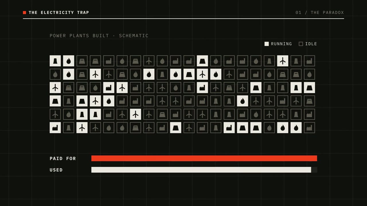
OUR NOTEA data-driven explainer intro on Pakistan's electricity paradox, with load-shedding bar charts, a large 47,839 figure, a grid of power-plant icons and a price-demand loop chart; made zero-shot, with Claude running an open-source TTS model and layering sound effects.
Jumping on the Claude Code + Hyperframe bandwagon.

I made this intro completely zero-shot using Opus 5.5.

Claude downloaded and ran an open-source model for text-to-speech, added the turbine sound at the start, layered in the other sound effects, and nailed the motion and visuals.

The accuracy of the whole thing is unreal. I’m in awe.THE PROMPT
Partial prompt — the creator shared only part of it.
Jumping on the Claude Code + Hyperframe bandwagon.
I made this intro completely zero-shot using Opus 5.5.
Claude downloaded and ran an open-source model for text-to-speech, added the turbine sound at the start, layered in the other sound effects, and nailed the motion and visuals.
The accuracy of the whole thing is unreal. I’m in awe.MAKE ONE LIKE THIS
Three steps, using what the creators in this index used.- 1 · Copy the prompt
Use the prompt above as your starting point, then change the subject and the style.
HOW OTHERS WROTE THEIRS → - 2 · Direct it like an editor
- Ask for one self-contained HTML file on a fixed 1920×1080 stage.
- Link this video as the reference for pacing and style.
- Send two or three rounds of specific notes.
- 3 · Render it to MP4
A short piece like this can be screen-recorded, or captured frame by frame for exact timing.
TURN AN HTML ANIMATION INTO AN MP4 →
The creator didn't name their tools. Most videos like this are HTML, canvas or SVG animation written by Claude and screen-recorded or rendered to MP4 — how that works.
Indexed Sep 30, 2026, 2:01 PM · Views as of indexing. Video and post © their creator.