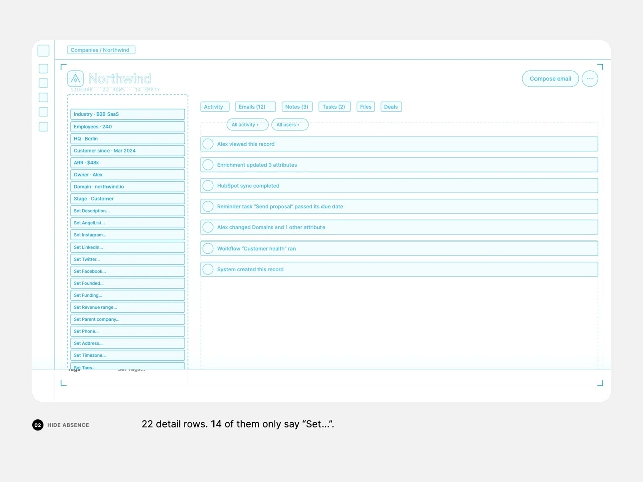
Wireframe CRM record redesigned into a cleaner layout

163.4K views · 2.0K likes · 2.7K saves · 50 reposts · Posted Sep 27, 2026 · 0:42 · Explainers
OUR NOTEA 42-second UX case-study animation that walks a CRM company record from cluttered wireframes to a cleaner final design, with captions like 'Six buttons with the same weight' explaining each change and a reply side panel.
I was struggling to explain my UX decisions in interviews, so I made this kind of animation with Opus 5.5

Anyone want the skill?THE PROMPT
Partial prompt — the creator shared only part of it.
I was struggling to explain my UX decisions in interviews, so I made this kind of animation with Opus 5.5
Anyone want the skill?MAKE ONE LIKE THIS
Three steps, using what the creators in this index used.- 1 · Copy the prompt
Use the prompt above as your starting point, then change the subject and the style.
HOW OTHERS WROTE THEIRS → - 2 · Direct it like an editor
- Ask for one self-contained HTML file on a fixed 1920×1080 stage.
- Link this video as the reference for pacing and style.
- Send two or three rounds of specific notes.
- 3 · Render it to MP4
A short piece like this can be screen-recorded, or captured frame by frame for exact timing.
TURN AN HTML ANIMATION INTO AN MP4 →
The creator didn't name their tools. Most videos like this are HTML, canvas or SVG animation written by Claude and screen-recorded or rendered to MP4 — how that works.
Indexed Sep 30, 2026, 2:01 PM · Views as of indexing. Video and post © their creator.