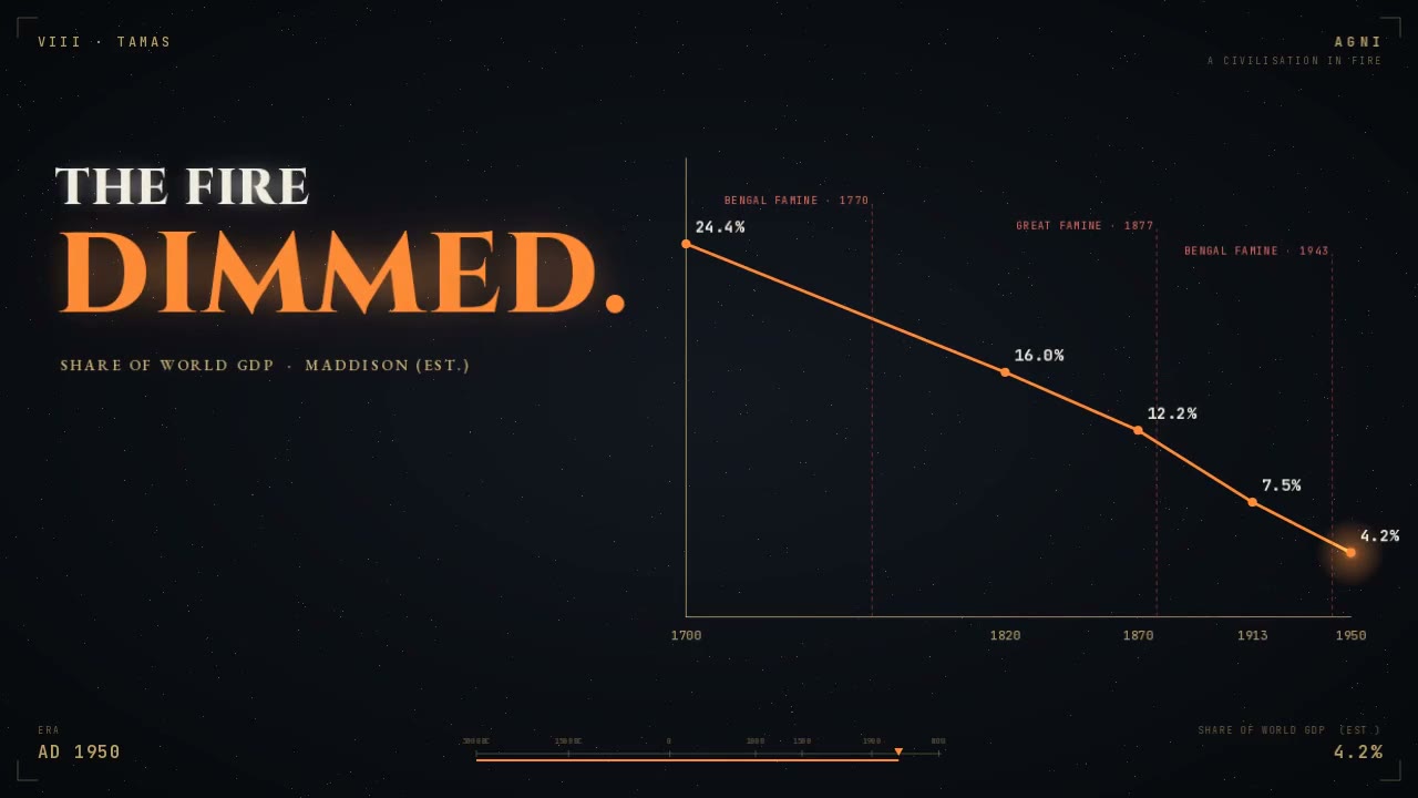
Chart of India's falling GDP share in a 5,000-year history

100.2K views · 4.0K likes · 2.1K saves · 1.1K reposts · Posted Sep 25, 2026 · 3:43 · Explainers
OUR NOTEA three-minute history of India across 5,000 years; this frame, "The fire dimmed", charts India's share of world GDP falling from 24.4% in 1700 to 4.2% in 1950 against famine markers.
5,000 years of India in 3 minutes.
(Opus 5.5 is incredible.)THE PROMPT
The creator didn't publish a prompt for this one. The post text is below.
MAKE ONE LIKE THIS
Three steps, using what the creators in this index used.- 1 · Copy the prompt
This creator didn't share a prompt. Start from our template instead.
PROMPT TEMPLATE → - 2 · Long piece? Give Claude a framework
- RavenMulti-agent research, coding and design orchestration★ 4.1k
- vox-directorPaper-collage style explainer and ad videos★ 2.1k
- video-talkcraftVoiceover-synced kinetic-text explainer videos★ 1.3k
- 3 · Render it to MP4
For a longer piece like this one, render with a framework so the timing is exact on every take.
CLAUDE CODE + HYPERFRAMES / REMOTION →
The creator didn't name their tools. Most videos like this are HTML, canvas or SVG animation written by Claude and screen-recorded or rendered to MP4 — how that works.
Indexed Sep 28, 2026, 8:28 AM · Views as of indexing. Video and post © their creator.